Datalab Faculty
Jessica HullmanProject Description
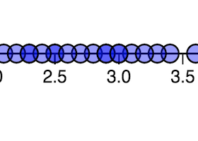
Visualizations like scatterplots and bar charts are common ways of presenting data for analysis but in contrast to statistical analysis, visual analysis introduces perceptual errors and cognitive biases. This project explores what factors, related to both the data set and the visual presentation of the data, most impact a person's judgments about the data.