Data visualizations convey patterns by encoding data in the visual attributes (e.g., color, size) of graphical marks (e.g., bars, lines). Interaction allows analysts to manipulate and compare large datasets. The DataLab develops better tools to facilitate visualization-based analysis and communication.
Current Projects
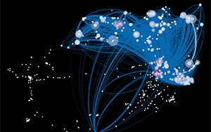
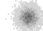
For hundreds of years, scientists have been laying down trails of citations. These trails form a vast network, where papers are nodes and citations are links. This network can tell us a lot about the formation of new ideas, fields, and technology. We can identify salient papers and authors. We can construct maps that help us navigate this ever growing network. And we can better understand how information flows in social systems. These are some of the goals of the Eigenfactor Project (http://www.eigenfactor.org).
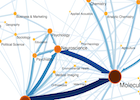
VizioMetrics is an image search engine and classifier. In order to improve it, we would like to automatically identify a “central figure” in a scientific article in cases when multiple figures are present. We defined “central figure” as a single visualization that encapsulates key aspects of a paper, a graphical summary that captures the content of the article for readers at a single glance. We surveyed 488,590 researchers in the biomedical field and found out that for an overwhelming majority of papers their authors were able to identify a single “central figure.”
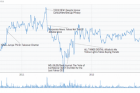
Many people, including analysts, find uncertainty and probability difficult to reason about when working with data. The use of null hypothesis significance testing is increasingly criticized, however we lack good representations of uncertainty that can provide analysts and readers of scientific literature with “cognitive evidence” for understanding variation, reliability, and related statistical concepts.
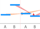
This project has focused on developing a method for visualizing uncertainty more concretely as a set of possible outcomes. By watching possible outcomes “play out” in an animated or interactive format, the user gains a better sense of which data patterns are reliable and which are not. The approach generalizes to a number of data inputs and complex visualization types that lack uncertainty representations.
Visualizations like scatterplots and bar charts are common ways of presenting data for analysis but in contrast to statistical analysis, visual analysis introduces perceptual errors and cognitive biases. This project explores what factors, related to both the data set and the visual presentation of the data, most impact a person's judgments about the data.
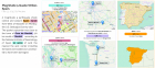
Visualizations are often used to communicate about data, for example in the media where interactive graphics are designed to supplement text articles, and in communicating analysis in research and industry settings. Presentation order, annotation, and consistency in the design of multiple visualizations are just a few considerations that impact communication-oriented visualization.
Most visualization tools, however, focus on supporting analysis. One aim of research in this area is to develop better tools for automatically and semi-automatically constructing such visualizations. For example, how can we develop semi-automated algorithms that help suggest good presentation orders and designs to a narrative visualization designer? Can we automatically construct annotated visualizations to make it easier for news and other organizations to generate visualizations to contextualize text articles?
Many visualization systems focus on expert users, such as trained statisticians or researchers. The focus of research around such systems is often driven by technical of perceptual questions, rather than cognitive ones. This project develops tools and theory around thinking with data more broadly, including for using visualizations for learning, reasoning and social interpretation.